This is very interesting trend analysis. The graph below is for one of the model farmers of the kebele.
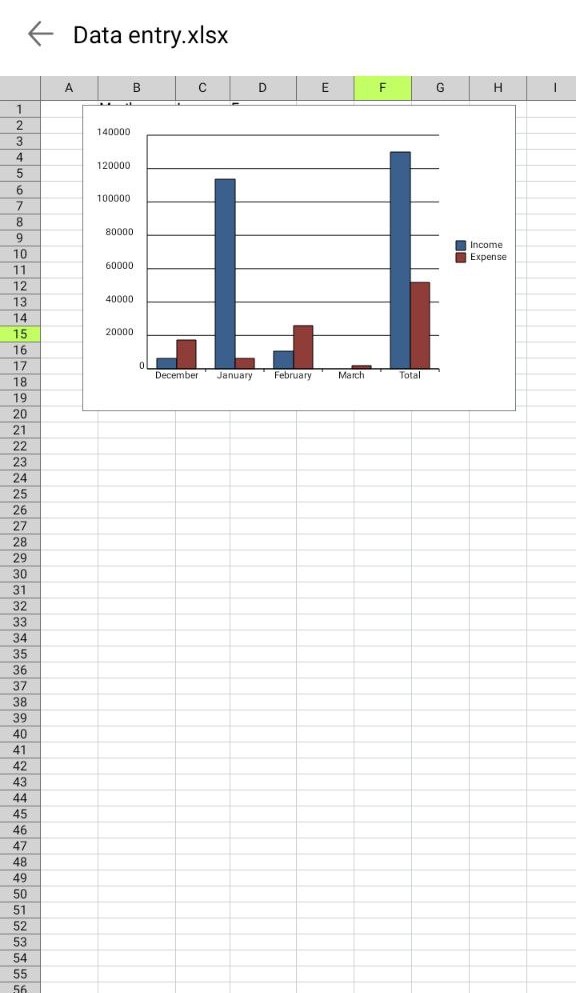
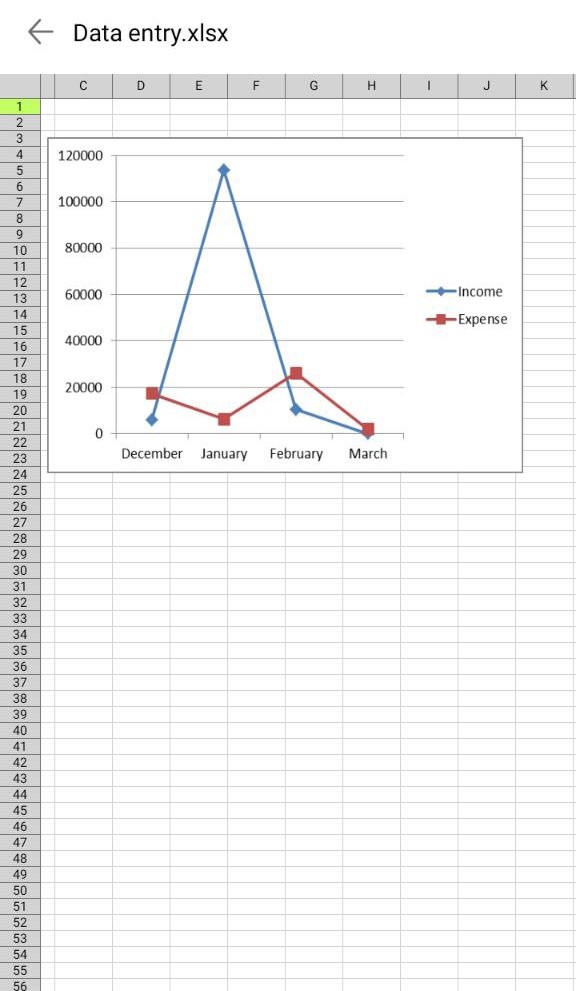
January was the month in which he generated more income than others whereas, February was the month in which his expenditure was high.
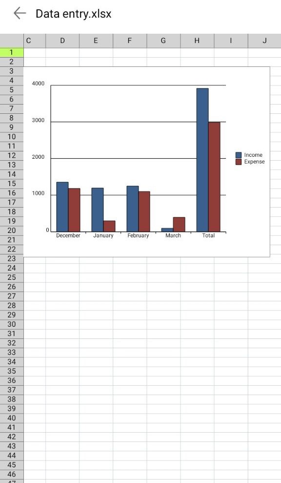
Look at this SHF data. She is FHHLD. Her income and expenditure seem similar across months.